
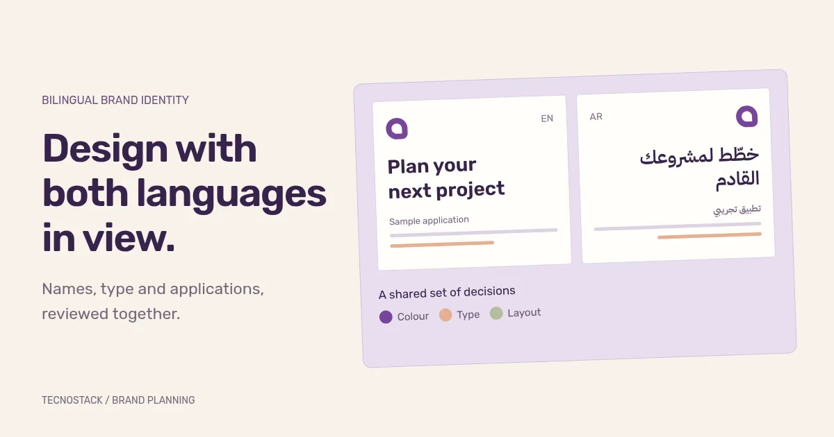
A bilingual brand identity needs agreed Arabic and English names, usable logo arrangements, compatible typography and examples from the places your team will actually use it. Review both languages while choosing the design. A translated label added at the end can change the balance, spacing and meaning of an already approved application.
Start with a short decision record. It should tell the designer who the identity serves, which languages appear together, what must remain recognisable and who can approve wording. The worksheet below is a planning aid, not a fixed package of deliverables.
Write down the approved Arabic and English forms, including spelling, capitalisation and any descriptor. Distinguish the public-facing name from wording that must appear on particular business documents. Give the designer an authoritative reference instead of asking them to choose between names copied from old presentations.
If a name is still being developed, flag that dependency. A placeholder can support a layout exploration, but approving a logo around it does not resolve naming or clearance. Identify who owns those separate decisions and when the designer receives the approved wording.
Then define the language roles. Your Arabic website may show an Arabic name beside the symbol, while a bilingual presentation shows both names together. A small profile image may use an approved symbol alone. These are different arrangements of the identity. Decide which ones you need before requesting exports.
Complete this table with the people who approve brand and content work. Where the answer is unknown, record an owner and a decision date.
| Decision | What to record | How to review it |
|---|---|---|
| Name and descriptor | Approved wording in each language and its source | Read it aloud and compare every spelling with the approved reference |
| Audience and setting | Who reads each version and where both languages appear together | Use an actual website header, proposal or sign as the test |
| Language priority | Arabic-first, English-first or paired arrangements for each application | Check that the intended reading order is clear |
| Tagline and key message | Meaning and tone in both languages, with a named copy approver | Review natural wording before judging its visual fit |
| Existing recognition | Elements the team intends to retain and why | Compare old and proposed applications at usable sizes |
| Production needs | Digital, print and editable-template uses included in the project | Confirm the receiving team can open and use the required files |
Avoid a vague instruction such as “make both languages equal”. Explain whether you mean equal prominence on a particular sign, equivalent tone across two websites or consistent treatment in sales documents. A designer can test those requirements. They cannot infer the intended relationship from the word “equal”.
Ask to see the approved symbol and wordmark combinations at the sizes you intend to use. Include a narrow website header, a document heading and a small social profile if they are part of the scope. Review both light and dark backgrounds where needed.
Check the Arabic letterforms and spacing with a fluent reader. The English and Arabic names may have different lengths and shapes; forcing them into identical dimensions can make one version harder to read. Agree the visual balance from actual specimens, then document the proportions and clear space.
Do not automatically reflect a logo when the surrounding page changes direction. Ask the designer which arrangements are approved and how each sits in the layout. A page's reading order and a mark's geometry are separate decisions.
The identity also needs instructions beyond a logo file. IBM's public design resources, for example, organise typography, colour, grid and other brand tools alongside logo-use resources. That is an example of a documented system, not a requirement to adopt IBM's assets or style. IBM Design Language resources
Compare headings, short labels, body paragraphs and numbers in both languages. Check the weights your team will actually use, plus the fallback when a font cannot load. A typeface that looks convincing in a large specimen may need different spacing or sizing in a dense document.
A family with Arabic and Latin support can be a useful starting point. The IBM Plex project, for example, lists Arabic support and a dedicated Sans Arabic package. Coverage alone does not decide whether the family suits your brand. Test your actual copy, and record the font files, source and terms relevant to the planned uses. IBM Plex project
Keep the review material consistent. The following invented copy set lets you compare the same kind of message without treating a short English word as a substitute for a complete Arabic label.
| Application | English sample | Arabic sample |
|---|---|---|
| Service heading | Plan your next project | خطّط لمشروعك القادم |
| Appointment action | Choose a suitable time | اختر الوقت المناسب |
| Confirmation message | We have received your request and will contact you | استلمنا طلبك وسنتواصل معك |
| Document reference | Reference: TS-2048 | المرجع: TS-2048 |
Replace these samples with approved content before acceptance. Add your longest real service name, punctuation, a website address and any diacritics your content uses. The test is whether the design carries your message clearly in the intended medium.
Assign a purpose to each colour: a main brand colour, a background, a text colour or a supporting accent. Show approved foreground-and-background pairs instead of handing over isolated swatches and leaving every team to improvise.
For digital text, WCAG 2.2's contrast criterion generally requires 4.5:1, with 3:1 for large-scale text and specified exceptions. Text within a logo has an exception; ordinary website copy does not become exempt because it uses a brand colour. Keep readable text and control states in the application review. W3C's text contrast guidance
Separate digital and print specifications where both are needed. Ask the production supplier to review proofs for the intended material and process. A colour on your laptop is a reference, not acceptance of every printed result.
Review an Arabic page as Arabic content. For HTML, W3C recommends declaring the document's right-to-left base direction with dir="rtl"; declaring the language alone does not set that direction. The layout and development handover must carry those decisions beyond a design screenshot. W3C's structural direction guidance
Check a bilingual name beside a symbol, a mixed-language reference and a long button label. Decide which layout relationships follow reading direction and which remain fixed. Our Arabic RTL UX checklist covers the component and interaction checks needed when the identity enters a website or product.
Use this list when reviewing the proposed system with your designer:
- Name: the approved spelling appears consistently in all supplied arrangements.
- Logo: the required language combinations remain readable at their intended sizes.
- Type: real Arabic and English copy works in the agreed headings, labels and paragraphs.
- Colour: the guide shows usable combinations for the planned digital and print applications.
- Layout: paired and separate language versions have a clear reading order.
- Applications: a colleague can use the agreed templates with new content and preserve the design.
- Ownership: the team knows where approved files live, who can change them and who reviews each language.
Keep failed checks attached to a concrete example. “The Arabic service name wraps behind the symbol in the mobile header” gives the designer an actionable correction. “The Arabic version feels wrong” needs a discussion before anyone can estimate the change.
Share the language decision record, existing assets, intended applications and unresolved naming or copy questions when requesting a brand identity scope. Agree which research, logo arrangements, guidelines and editable applications the engagement includes.
If the identity will enter a product, also identify the UI/UX handover. If your team needs recurring campaign assets, define that production separately through the creative-content service. This gives each receiving team an approved reference and a clear job to carry out.


